
When researching for an online magazine, I came across a issue that Burnt Mill do, although it is not student run, I found that it was still worth looking in to.
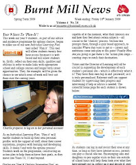
What strikes me straight away about this magazine is how the heading hits you straight away. It is neatly in line with the Burnt Mill badge to the left of it, and the arts colleges symbol to the right of it. This symmetrical look gives the magazine a formal look and feel to it almost immediately.
The first article is about the year 9 students beginning a programme for Burnt Mill's new individual learning plan. It is noticeable that if you look at the left hand side the beginning of the new sentences are completely in line, as well as the picture. This gives it a more formal look and shows that the magazine is neat and tidy. They have included two photographs on the first page, with a badge in the first article about plan it.
The second page is about the new plasma televisions that have been put up around the school. The next article on the page goes on about the current year 11 leaving, and how they have had their year photograph taken that will go up on the wall with the previous year 11's from years before them, and how the students can be seen looking at relatives in the photos from before.
The language used in this magazine is extremely formal, indicating that it is aimed towards the parents more so than the pupils. Although pupils are known for reading the magazine, it is informing the parents about what is happening around the school.
However, there is a section, with a question on Barack Obama, and after it says:
"This question carries a £20 gift prize of a Woolworths - sorry, I mean HMV voucher for the first correct answer out of the box at astudent services."
This makes the magazine a bit more informal by including a joke, and makes it seem a bit more relaxed.

A good analysis. I would be interested to know what you took away from looking at this magazine. Is it a style you would use? Why or why not? I agree with what you said about audience - it seeems more directed towards informing parents rather than students. Perhaps you can look at some student-led magazines and compare styles? When you find a good one, of course.
ReplyDeleteOh, and I know the answer to the question about Obama. Think they'd let me enter the contest?