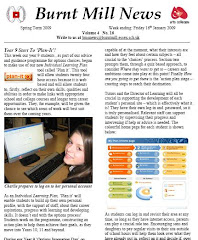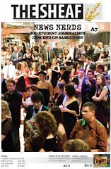
This is my contents page for my final product. I am actually really pleased with this contents page, the colour scheme used in particular, as I feel it really meets my audience and their personalities quite well. Pink yellow and purple are the popular colour whilst growing up in the ages of 9-14, as girls that age feel it is their identification in a way. The two pictures I included, one was of my male model who features as the 'free poster' and one is of my other male model who is the featured artist I do an interview with. I felt that the contents page worked particularly well, and that it looks quite professional.
I kept the house style running the same, with the lighter purple across the top with the same colour font used for the world "glimpse, contents" and the female symbol.
It is obviously extremely important to keep the house style the same as it identifies the magazine, and makes it look as one. If it wasn't the same then it would be easy enough to take the magazine apart, and say that it belonged to different ones.
Overall I am happy with my contents page, the only downfall I would say it has, which is evident now is the fact that it appears to be a bit plain in the top right hand corner, and is lacking an image of something or some sort of text to make it look a bit more full, other than that, I would say it looks quite professional and I am happy with it.


No comments:
Post a Comment