On Monday 23rd February, we designed a spider diagram in groups and wrote all the key features that we believed were in relation to different music genres. The main ones we looked at was Pop, Hip Hop, Dance and Rock. On Wednesday 25th February, we were given the task to look at different music genres and decide whether what our spider diagrams originally contained were not far off what the magazines actually had.
My group's main focus was the genre Pop. We thought the colours are generally vibrant, bright colours that are attractive and keep the attention of the eye. We believed the main audience to be young girls and some young boys, aged between 12-15. Typical Artists were people like Girls Aloud, The Ting Tings etc. The lanauge used in the songs can sometimes contain abbreviations that young people commonly use, like "lol" (laugh out loud) and "bff" (best friends forever).
When studying the magazine, we found ourselves to be mainly correct. However what surprised us was that the magazine was not aimed at boys what so ever. The colour scheme we believed to be correct, although it indicated it was only for girls because the main colour was pink, and it also had what young girls would class as "heart throbs".
Zac Effron, who is known as a main model for the girls at a young age, almost featured on literally every page. The adverts in the magazine were aimed at a young audience, girl products were also advertised.
There were a lot of pages on love and there were also quizzes, and things like celebrity love matches, doing a quiz and finding out who you match with in the celebrity world, all of these being of course, boys.
Throughout the magazine there were random posters of men idols.
The magazine also contained free gifts, which attracts the reader, but the gifts were a free Pineapple dance bag and also a free huge poster of Zac Effron.
The main things we thought this magazine would contain were correct, however we found it quite strange that it was even more so than we believed. Like the content was so much more girly than we thought.
Pop is most definitely aimed at a girl audience, ages ranging from 11-15.
The magazine clearly identified this.
Thursday, 26 February 2009
Monday, 9 February 2009
Nature Magazine - front cover
On Wednesday 28th January, we were given the task to create a front cover, using the pictures we had taken the previous week, and make it into a front cover for a nature magazine, using photoshop.
We got into groups of around 2 or 3 and used photoshop together in our groups.
Once the pictures were uploaded onto the computer from the previous lesson we decided to use a medium close up of a picture that was taken of ducks. This included two ducks, one on the far left hand side of the photo and one on the far right hand side.
Originally we uploaded the picture onto photoshop, and managed to get it directly into the middle of the page. Then made the background above and below the picture green and had black writing at the top and the bottom, we also included a paw print to show that the magazine is based around animals in nature.
However, after this we decided that to make it look more professional, we should have the ducks as the background instead so that it took up the whole page. Once we done this we realised it looked much better and quite a bit more professional. However, we had previously cut out a picture from an image we found online of ducklings and put it onto our magazine, looking back at this we realised it didn't look quite as good, and removed it.
We also included some puffs on the front cover to show what was to come inside the magazine.
If I was to do this magazine again I would try to use photoshop a bit more often before hand as I am still struggling to learn all the different features of photoshop.
I also feel that planning is quite crucial as well, creating a magazine without being entirely sure what affect you're going for, can actually lead to it not turning out so well. Therefore I will ensure that when it comes that I create my magazine, a lot of planning will go into it. I will also plan what audience I am aiming at, as I will need to gain an understanding of what they will want to see in the magazine.
(photo to be included once uploaded)
Thursday, 5 February 2009
Photoshop Tutorial
On Friday 30th of January, our class had a photoshop tutorial from the ICT technician Mark. He explained all the different things we could use to edit our pictures. He also showed us how to have different layers of the magazine we are designing, so if ever you make a mistake, you do not have to start from the beginning, you can just go on to the original layer of the work.

He also explained that when cutting a picture out from another picture, and putting it into the original, you have to use the tool called lasoo, but also, you have to heighten the percentage that the picture is feathered, because if not, then the edges will be really rough.
I definitely learnt a lot from this lesson and took down a lot of notes but I feel that I will personally need a lot of practice to get used to photoshop, as it didn't feel enough just to watch and listen. I will find images and make them into a magazine front cover, so I can get used to the tools that are appropriate to use etc.
Thursday, 29 January 2009
Burnt Mill Magazine

When researching for an online magazine, I came across a issue that Burnt Mill do, although it is not student run, I found that it was still worth looking in to.
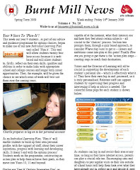
What strikes me straight away about this magazine is how the heading hits you straight away. It is neatly in line with the Burnt Mill badge to the left of it, and the arts colleges symbol to the right of it. This symmetrical look gives the magazine a formal look and feel to it almost immediately.
The first article is about the year 9 students beginning a programme for Burnt Mill's new individual learning plan. It is noticeable that if you look at the left hand side the beginning of the new sentences are completely in line, as well as the picture. This gives it a more formal look and shows that the magazine is neat and tidy. They have included two photographs on the first page, with a badge in the first article about plan it.
The second page is about the new plasma televisions that have been put up around the school. The next article on the page goes on about the current year 11 leaving, and how they have had their year photograph taken that will go up on the wall with the previous year 11's from years before them, and how the students can be seen looking at relatives in the photos from before.
The language used in this magazine is extremely formal, indicating that it is aimed towards the parents more so than the pupils. Although pupils are known for reading the magazine, it is informing the parents about what is happening around the school.
However, there is a section, with a question on Barack Obama, and after it says:
"This question carries a £20 gift prize of a Woolworths - sorry, I mean HMV voucher for the first correct answer out of the box at astudent services."
This makes the magazine a bit more informal by including a joke, and makes it seem a bit more relaxed.
Online school magazine - search one
I have been researching for the past hour for an online school magazine and am finding it a very hard task. It is easy to find details of one but to actually find an online one is hard. I have looked at local schools in my area, but fail to find a student run magazine.
I will continue my research and endeavour to find one.
It is extremely simple to find University magazines, but is a challenge to find school magazines.
I will continue my research and endeavour to find one.
It is extremely simple to find University magazines, but is a challenge to find school magazines.
Wednesday, 21 January 2009
The Sheaf
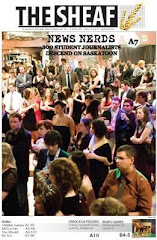
In today's lesson, we carried out research on a newspaper for a university.
The Sheaf has been the University of Saskathewan student's newspaper since 1912 and has distinct features that I will use, that I didn't think of before.

It's distribution is weekly, however, I think weekly would be a bit too much for a magazine at school, therefore I am considering distributing my magazine fortnightly.
In this newspaper, it included campus chat, which was very entertaining, in mine it would have to be different, involving the students as it is a younger age.
An opinion poll was another idea I came up with whilst looking at this newspaper online.
Advice pages would be good for students in sixth form, helping people coping with stress and for people to write in, also letters to the editor would be good.
I also read that The Sheaf has a policy, which I would include in my magazine.
Today's lesson was extremely useful in learning about this newspaper, and although it is a newspaper it has helped me understand what students want, and what content would be good to include in my magazine.
Pleminary Task
On Monday's lesson, 19/01/09, we were set the Pleminary Task.
The task involves creating a front page and a contents page for a school magazine, which must include a medium shot of a student.
The magazine must also include a minimum of 4 images.
I will endeavour to keep my magazine simple, and set myself realistic tasks.
I have decided to use a blog as a way of recording my research.
I will start my research into real texts, considering audience awareness and I will plan carefully thinking in terms of stages and I will also ensure that I follow my deadlines.
It is extremely important that I set myself goals and stick to them.
For my research, and using my blog, I will answer the following questions:
1) In what ways does your product use, develop or challenge forms and conventions of real media products?
2) How effective is the combination of your product and evaluation texts?
3) What have you learned from your audience feedback?
4) How did you use media technologies in the construction, research planning and evaluation stages?
Subscribe to:
Posts (Atom)