(10.12.09)
A couple of weeks ago we were given the task to create a music video, we were told that this would be our preliminary task. Again we were put into groups and were each given a CD. My group consisted of Lizzie and Danny, again I was happy with this as I get on with them both well and knew we would successfully work well together.
After listening to the song we found that it was Montell Jordan - This Is How We Do It, we realised that the pace of this song was extremely fast. We began by looking at each line of the song, and knew that by then this was going to be very difficult to lip sync the artist singing the song because the pace of the song was so fast.
We began planning the song and how we would shoot our video, and we planned to shoot it the next Tuesday in our double lesson.
We didn't plan a fantastic story board as we were all so sure and had the perfect image in our head of how it would be so we just wrote notes down.
When we came to filming however, we found out that this certainly was not the case.
We grabbed Lewis who we wanted to be our artist and began filming, he did not know the lyrics and none of us considered to have the song with us on an ipod or anything so that he could lip sync in time, we did not realise this would be important until it came to editing as this was our first task for a music video.
When we began editing and playing it back we realised we did not have enough footage, although after filming we thought we did, so Danny said he would film some stuff when he got in to try and make up the time. When it came to editing again although we found that the stuff he done was good we realised that it was not fitting with the song but we had no other choice but to use it.
As a group we were really disappointed with our video, but in a sense we were also happy it had turned out the way it did so we had learnt a lesson for our final piece of coursework to ensure we film as much as possible and even if we deem it as unecessary footage we know that we may need to use it incase some of the footage didn't work out.
Here is our final video:
Thursday, 10 December 2009
Monday, 9 November 2009
Saw Sweded
(09.11.09)
We were given the task at the beginning of November to swede a trailer of our choice.
Sweding a trailer is where you take a trailer and re-do it, but using no money to do it and trying to make it look as good as possible.
Our teacher put us into groups this time, which I thought was a good idea because it helped me learn to work with other people and also the groups were a lot smaller so we could interact and share our ideas more easily. Also our group consisted of Lizzie, Leone and myself, these are two girls that I get along with very well so I was pleased to work with them in a group.
During one of our lessons we looked at sweding Shaun of the dead, we thought this would be good, we planned to get a group of friends to act as the zombies and thought we could work this out really well.
However, nearing the end of the lesson one of us came up with the idea of doing Saw. We thought it would be quite easy and fun to do, taking the first ever Saw film and making paper chains, making a saw or borrowing one from the graphics department, and there is a disabled toilet in our school that looked quite like a bathroom so we thought it would be a good idea.
The next two lessons after this we were planning how to do it, what to wear, what to bring in, and we decided that the second lesson we would make our paper chains and gather everything together in time for when we decided to film. We gave ourself the two hour lesson we have on a Friday to film it and also get make-up and clothing done.
We filmed it in perfect time and it went a success with the filming, the next two lessons we decided we would spend them on editing.
We found that our video was a huge success, ranking 3rd over the whole year group who study media. However from our feedback we found we would have got a higher mark if we would have made the video a little bit longer, but we felt on a personal note that there was no way to make it longer as we had covered all the material that was in the trailer, so we were happy as a group with our finished product, and here it is:
Tuesday, 27 October 2009
Consider the consequences
(27.10.09)
We were given the task in class to create a video for a competition, and the title we were given was 'Consider the consequences' - the brief for this video was to demonstrate the consequences of under age drinking, showing the effects and trying to convince underage drinkers to stop drinking, or to prevent them in the first place.
We were given the task in class to create a video for a competition, and the title we were given was 'Consider the consequences' - the brief for this video was to demonstrate the consequences of under age drinking, showing the effects and trying to convince underage drinkers to stop drinking, or to prevent them in the first place.
Our video did not turn out how we planned it, and I was not happy with the result at all. I was very disappointed at how our video turned out. I put this down to a lack of planning, but also rushing the story line. We were well prepared at the beginning, we found some actors in the lower school, as we thought the representation of students wearing school uniform was important to show in our video. We felt that it was a good idea because it would help students around the county to relate to the characters in our video.
We planned that we would show a character collapsing at the end to show the real effects, we also planned that we would show students attempting to get someone older to buy them alcohol, and then show them taking it to the forest and drinking it there, as it is a known thing that younger people go to drink out in the streets or in local forests or wooded areas in attempt to drink without being seen.
Because we were taking students outside the school grounds during school time, we had to have a couple of members of staff to escort them.
The day we selected to film, we had to go ahead with, but the weather was awful, and it was so difficult to film. The members of staff were concerned that it was not good to film with the students outside in such weather so they kept trying to rush us to finish filming, and we were under a time limit of 2 hours for our lessons anyway.
With the weather being the way it was and the members of staff trying to rush it up as quick as possible, the ending had to be cut short and a couple of members of our group decided that the ending should be as quick as possible so they said that it would still work if we put the students saying they were going to be sick, and then quickly ringing for an ambulance. This made no sense really when we watched it back, because people are sick everyday and ambulances aren't just called for that.
Overall I was disappointed with our finished product, and drew the conclusion that large groups do not work well together as the more people in the group the more likely there is to be conflict, as there are a lot of ideas. There were several times when a couple of people did not get on well in our group due to such a lot of ideas.
I have also learnt that you need to ensure you have more than enough time to film because when we done ours we found that we did not have enough time to do it in as the day we filmed it was raining all day but we had no option but to get it done.
Even though we did not have an excellent video, I learnt a lot from this experience.
Monday, 29 June 2009
Filming the PSA - Women's safety
In today's lesson we began to film our PSA. Due to unforseen circumstances I did not attend the lesson previously, however my group quickly and efficiently filled me in on the story board and what I had missed in the lesson.
We got to filming, and our first job was to find the characters, we got our main characters, (3 girls and 1 boy) and began filming behind the back of the school.
The original plan was to film at a pub, however due to the time schedules it is difficult to be able to get to the pub, film, and get back in under an hour.
We began filming our first few shots, and these went really well. The weather outside was ideal because it was not windy, therefore the sound was not distorted and there were no distractions.
We managed to shoot about 13/14 clips and it went really well. We will be finishing them next lesson and then beginning to edit them again on iMovie - I found this lesson gave me more confidence in filming because it enabled me to get used to a different surrounding for filming and learn how to film in the appropriate shading/lighting due to the sunshine.
I also felt more confident in filming because after watching my filming afterwards, espcially the panning, I felt that it looked quite good in comparison with the other times I have filmed.
Monday, 22 June 2009
Public Service Announcement - Research
Today in lesson we were told of the upcoming task we have to prepare for. We are to shoot a short film announcment, about Women's safety or Women being raped - and the cautions they must take.
I found out in my research that:
A public service announcement (PSA) s a non-commercial advertisement broadcast on radio or television. They are aimed at either informing, educating or entertaining the public.
This was one video link that I discovered that was informative upon the Swine Flu epidemic that is currently spreading.
http://www.nowpublic.com/world/swine-flu-important-government-public-safety-announcement
I found that this was good as it was extremely informative and educational for the public.
I am currently trying to research for videos on YouTube about Public service announcements, but cannot find ones that are real from the government, so will keep researching and edit this post!
Sunday, 21 June 2009
The Phone Call
We were given the task in our last two lessons to go out and film clips for a piece called 'The Phone Call'. This consisted of a given set of shots we had to film.
We chose our first character, and decided we would set him in the common room, but taking note of what happened last time we took note of the mise-en-scene and actually sat him in the corner of the room, where it looked refurbished with all the new chairs, so it seemed a very clean and well created atmosphere with good surroundings.
We filmed several shots, and I took note of what we had 'Dan' say. he said "Hello, You alright? Yeah I'm fine thanks."
It occured to me that the second character would have to respond to this chat, and it wouldn't have sounded right if he was saying the same thing back, so we had Dan say the above, and then 'Jez' said "Hi mate, yeah I'm fine. You?"
It seemed realistic to take note of this because we knew when were going to edit our filming on iMovie, we would have to change the clips round and put them in order that made the filming seem realistic.
I felt that our filming was so much better compared to last time, and I felt I had improved too, because I was taking note of the small things that I didn't realise before, like making sure I did not cut the heads off!
If I had to level myself right now, for that piece, I'd say I was verging on becoming a level 3. I do not believe I have yet had the correct level of experience with filming to be a solid level 3, and I believe practice is the key to being able to film correctly, learning and developing your own technique that works well.
I really enjoyed this piece of work, it helps working in a group too because we all learnt from each other's mistakes, not just our own.
Wednesday, 17 June 2009
The Phone Call - Our story board
For 'The Phone Call' (overall summary in following post) my group designed a storyboard that we would follow in filming our different clips. We took time on our storyboard and made it realistic so that we would stick by it and make sure our plan went as intended.
The first page of our storyboard:

Our drawings weren't very good! But it gave our plan an overview of what we were expecting our first 4 shots to look like.
The second page of our storyboard:

The third page of our storyboard:

The fourth page of our storyboard:

Overall I think that the storyboard will help us in the filming of The Phone Call as we have been able to plan ahead and already know what is expected to come out of this. I will post another blog in a couple of days to write about how the filming went.
Friday, 12 June 2009
Filming - Wednesday 10th June
On Wednesday 10th June we were given the task to go out again but this time film a tour of the school for prospective new sixth formers.
In our filming we tried to involve a range of shots. For the introduction to our piece we filmed our head of year, and Matt was in charge of filming this. When reviewing this we felt he held the camera still very well, and it was a very good shot of a medium close up, however, the positioning of Mr Taylor was not that good, he appeared to be a bit low and it became evident that we could have positioned the camera a bit lower so he was in the centre of the screen a bit more.
For our next shot we filmed the common room. Overall the shot was well done however the common room may not have been the ideal choice as the room is currently in the middle of refurbishment, therefore it became evident we didn't really think about the setting at the time.
The next shot was a tour of the sixth form block, we thought at the time it was a good idea but it was only when I watched it back that I realised just how long we were filming it for, and it got boring, and there was silence when there shouldn't have been. There were also a few faults such as when we were pointing out the different rooms, we focused the camera on the door and looking back it did not look right and it looked a bit pointless.
Overall I felt much like the last lesson I learnt a lot from this lesson and also feel I have a greater understanding about what is right to be in a shot and that you must consider the scene you are shooting and whether it is relevant or not.
Filming
On Monday 8th June we were set the task to go out and film several shots. We went in a group of 4 and decided to film our shots around the school. During this session I learnt a lot about the different shots involved such as; extreme close up, medium close up, long shot, medium long shot, over the shoulder, tracking, panning, tilting, two shot and many others. For my first real time at filing I don't think I done too bad with getting to grips with what the shots are howevere there were some obvious faults such as when I was filming a medium close up it was not until I watched the footage back that I realised I had cu the top of Matt's head off.
As a group we also discussed the fact that we did not realise it would be fairly hard to even just hold the camera still and a certain skill would need to be developed to be able to hold it still.
Overall I feel this lesson taught me a lot and the next time I film shots I will be able to recognise and hopefully avoid these faults.
Monday, 27 April 2009
Double page spread

I'm really quite happy with my double page spread.
The main picture of my model featured on the page, with another picture of him, because on image would have been lacking on the magazine itself.
I was also particularly happy with the interview that featured on these pages, obviously I didn't start and finish the interview on these pages, because it is longer than just a few questions and it wouldn't attract the desired audience, as they probably wouldn't see it worthit (if they were mainly purchasing the magazine for the interview with 'Chris') just for a few questions to discuss about his career.
The house style was once again kept the same, however I also felt it necessary to include a purple bar running across the bottom, with the page number and "glimpse" written on it. I felt it was necessary to do so because it made the magazine recognisible if it had to be identified just by the style, and I have also noticed the same sort of style in other magazines when I was doing my research.
Overall I am pleased with the double page spread, and if I had to change anything I might have had re-thought the layout of the text, as it isn't in keeping as such with the front cover of my magazine.
Contents Page

This is my contents page for my final product. I am actually really pleased with this contents page, the colour scheme used in particular, as I feel it really meets my audience and their personalities quite well. Pink yellow and purple are the popular colour whilst growing up in the ages of 9-14, as girls that age feel it is their identification in a way. The two pictures I included, one was of my male model who features as the 'free poster' and one is of my other male model who is the featured artist I do an interview with. I felt that the contents page worked particularly well, and that it looks quite professional.
I kept the house style running the same, with the lighter purple across the top with the same colour font used for the world "glimpse, contents" and the female symbol.
It is obviously extremely important to keep the house style the same as it identifies the magazine, and makes it look as one. If it wasn't the same then it would be easy enough to take the magazine apart, and say that it belonged to different ones.
Overall I am happy with my contents page, the only downfall I would say it has, which is evident now is the fact that it appears to be a bit plain in the top right hand corner, and is lacking an image of something or some sort of text to make it look a bit more full, other than that, I would say it looks quite professional and I am happy with it.
Front cover

This is my final front cover for my final magazine.
I called the magazine 'Glimpse' as I thought it was a good name, because I saw it as a 'glimpse' into the lives of music celebrities/idols.
I thought it was a good idea to include the 'free poster' item on the front, to attempt to attract my readers into wanting to buy the magazine, even if it was simply for the poster and they glimpsed through the rest.
The main title of the interview with 'Chris', I included because I thought it would attract the young girl readers, because it is generally known if a male artist is in a relationship they become less attractive to the young girl audience, as they are then deemed unattainable by them.
The barcode and price was an essential feature as all magazines have them, so they are recognised in the shops when scanned. The date I also felt was a particular important feature to have, and the issue number. If people are intersted in the magazine and particularly follow it, then they are easily able to see what issue they have missed out or something, and what date the issue was in between.
The items down the left hand side I had were also used to mainly attract the readers, showing features that were coming in the magazine. I found out whilst making this the basis of a front cover is mainly used to actually show the audience what is in the magazine, more importantly attracting them to read it, and including features that they will be interested in.
Overall I am very happy with my front cover, if I were to do it again I think I might make it a bit more 'thrown about'. Every item on the front cover is perfectly in line, and although that is important, because it is for a young girl audience, it might have looked better a bit more put together, because then it would maybe appeal to them as it matches a young girl's personality.
Friday, 24 April 2009
My Evaluation
Now my media product is finished, I will be evaluating the ways in which my product reaches and targets the audience desired, and how I got to the finishing point.
Slide 1

My media product uses quite a lot of the same things that a typical music magazine would, that was aimed at young girls.
Slide 2

Slide 3

Slide 4

The audience for my media product was aimed at young girls, aged between 9-14. I felt that this would be a good age because this is usually the stage that a young girl is finding herself, who she is, going through the motions of growing up, starting puberty, becoming aware of the opposite sex and developing crushes on male celebrities and boys. They would also typically want to know the latest gossip in the celebrity world, and typically 'falling in and out of love' with boys that they begin to fancy at school, and their embarrassing moments they experience with them.
Slide 5

The process of construcing this product I found very very hard indeed. Getting used to all the different things you can do, and how you can construct it in very different ways. For example, one of my models needed to be edited, so I had to use the tool in photoshop that allows me to hide the spots that he had. It also taught me how to take photos correctly, and learning the different camera angles, and what my model would look best doing.
I also found it hard at first to be able to understand my desired audience, drawing from personal experiences of magazines that I bought when I was younger, I decided to buy a few music magazines, and to see if they still address the audience the way they used to, which I found they did.
I also learnt how to use blogger, because I never have before. I think it has been extremely helpful and it has also allowed me to express the difficulties I have had in constructing it. Things with images constantly kept going wrong, and to this date it still was. I had completed my contents page a few weeks ago, and it went off the schools system, and I could not retrieve it, therefore I had to re-do it again.
Slide 6

Attracting the audience of young girls aged 9-14 proved to be, for me quite simple. I realised immediately that the male singer, is the typical guy a girl would fall for, however there was more than that. By using the title I did, about "Chris talks to Glimpse, about fame, fortune, and the love he is still searching for."
Typical girls of this age would not be attracted to a celebrity that has a girlfriend, because they would either be heartbroken, or see him as unreachable. However if he is single, girls seem to get in their mind that somehow, one day, he might find her, and they could be a couple. It is a typical girl thought that this would happen, therefore saying he is still searching for love makes them think they have a chance with him, and the crush they have on him is worth having.
Female icons such as Alexandra Burke is good because she has just achieved a dream that a lot of young girls would like to achieve, as she just won X Factor. Fashion tips from her would be attractive to the young girls because they would potentially want to look like her, they would be likely to deem her fashion sense as something that helped her along the way to stardom.
When I purchased a few music magazines, it was evident to me that they ALL included free posters of MALE celebrities. I decided to include one in mine, and use the typical features that other magazines would, an boy that is from a group, with his top off, because this is what every other music magazine that I looked at featured.
Slide 7

Since I first attempted to do my magazine, the preliminary task, I have learnt that a lot of images are not necessary to obtain attention, and infact the busier it looks the more unattractive it looks, as it looks like there is too much going on to take in.
The main lesson I learnt from the preliminary task is to keep the house style the same, as that was something that I faulted in, when I first done the magazine.
Images should be arranged in an attractive and appealing way, not just chucked on the page and rotated anywhere, they also need to be appropriate to the content the magazine has.
Slide 8

In ways my magazine is the same as general pop magazines, but it is generally the smaller things that are evident. For example, I used the general colour scheme of purple, pink and yellow, to attract the young female audience.
The general idea of attracting a female audience of using a quote from the celebrity that has the main interview in the magazine.
My magazine is different because it appears to be more organised, as the other magazine seems a bit more 'messy'.
Also features that are the same are obviously the barcode, and the basics every magazine should have.
Wednesday, 1 April 2009
Photoshop and technical errors!
I've had such a hard session today with Photoshop and all the technical faults that just generally run with computers. I had a successful time with sessions at home I have been focusing on, fiddling around with my contents page and getting a good house style. I had a technical issue with my front cover two weeks ago at school, as images that I had forwarded would not come through.
This week was fine with images, as was last week, however I had sent my contents through and it wouldn't open, then photoshop wouldn't cut out the photo of my model who is acting as a poster, as I wanted to put it on a white background, but as soon as I managed to cut it out, it kept becoming pixelated. The hardest thing I found today was actually keeping my patience with it, and I had to have a break.
It taught me a lesson though, in the sense that I know from now on, send doubles through might help on a different format, even though I have done my pleminary task, there are still so many things that need to be learnt on photoshop!
Publishers of magazines
In lesson the other day we studied publishers of different magazines.
IPC
The link for this magazine is in the left hand tool that shows the links.
Looking at the brands of magazines it does, I came to the judgement that there would be not be a lot of competition upon using these publishers to publish my magazine. The only magazine, that proposes a high competition is one of the world's largest producing music magazines - NME. Other magazines that they do are things like Golf Monthly, TV & Satellite Week, Nuts, Marie Clare, Country Life etc.
"IPC Media is a leading UK consumer magazine publisher. Almost two in every three UK women and over 44% of UK men read an IPC magazine. That's over 26 million UK adults. "
The fact that it is distributed in the UK suggests that it would be a small place to start, rather than going worldwide, perhaps increasing my chances of my magazine being a success.
Pleminary Task - Marked and returned

I received my marked pleminary task back the other lesson.
If I were to do this task again, designing the magazine for a school, I would probably not include the background of St Marks school. At the time it seemed like a good idea, but upon reflection I feel it isn't necessary for the magazine. There aer also minor issues such as the light in the background, and the reflection in the windows.

I felt that the contents page was quite well done. The organisation of different sections in a table had a really good effect and made the magazine appear tidy. The fault that I discovered when looking at the front cover and the contents was that the house style wasn't necessarily kept identical. For example, for "Taylor's Tribe", I used the same font, although it doesn't appear the same because on the contents page I stretched the title of the magazine out, so the font appears to be different. It would have been a good idea to make the "contents" text a bit smaller, so I could have had the top of the front cover exactly the same on the contents page. The other fault was that I forgot that the requirement that it had to be original photography, and I included a joke picture that got online, which I will obviously make sure I do not do on the final task.
Overall I was happy with the magazine, and with the few changes I would like to make will be taken into consideration for my music magazine, such as making sure the house style remains the same.
Wednesday, 25 March 2009
Editing my photography
The photo in my previous entry was taken of my model, by me.
There were a few minor faults in the photo taken, and things that I felt needed to be blended into the picture and changed.
For example, on his face, next to his nose, there was a visible spot, and on the wall right at the top there was a big orange mark, these are defects that do not need to be in the picture.
Original photo:

Edited photo:

Although the changes are minor, they would be significant defects that would be noticed in a magazine. Celebrities are presented to all audiences as having no defects visible on them, and their surroundings are key to being perfect. By editing these out it means my magazine is more realistic in terms of being the same as real music magazines portray the celebrities.
Wednesday, 18 March 2009
Photoshoot
On the 11th of March I met with my model. We went to the Water Gardens, Harlow, as originally planned, and went to Esquires. In Esquires we sat down, and then an idea came that it would also be a good idea, for him to have a cup of coffee, so we could use that in the photos as a prop, to make the atmosphere as a whole, laid back. The first couple of shots I felt did not go as well as I had hoped, because I found where we were sat did not have a good enough background. We moved to a sofa in the corner of the coffee house, where the background was the wall, that clearly indicated it was a coffee house, and gave a more official feel to the photos.
The rest of the photos in the coffee house I felt went very well, especially the few where my model sat back with his arms across the sofa, smiling at the camera, as if he is just laughing or about to laugh:

Some imagines I found were successful but in certain ones there are unecessary elements such as other people in the background.
I also took a picture of another male model that I spoke to, which I will put on the front cover to act as a poster, this image went successful too.
Tuesday, 17 March 2009
My model
On the 6th of March I spoke to my model. Orginally, I thought that it would be a good idea to use a female model, so that the main audience my magazine is aimed at, being young girls, could relate to her and look upon her as a new role model. After looking at the ideas I had originally thought of, and comparing them with a new idea, I realised, in my opinion, that trying to introduce a new female artist as a role model would be hard, because young girls are less likely to pay attention to a new female artist, than they are to a new male artist. I decided that it would be best to use a male model, and introduce him as a new recording artist.
My model will feature on the front cover and double page spread of the magazine. The double page spread will contain photos of him, and also a personal interview with him, typically finding out what type of girl he is interested in, so that it captures my audience in the desired way.
On the 6th March I spoke to my model and told him what photographs I was looking at taking, where they would take place and the expected duration of the photoshoot. I thought and explained to him that spending a couple of hours with him would allow me to take a variety of shots, and allow me to have a greater choice in what shots I felt worked, and what I wanted to use in my magazine.
The setting I felt appropriate, was the Water Gardens, Harlow. In the Water Gardens, there are well known coffee shops, one with a particular setting inside that I thought I could base my 'interview' in, which was Esquires. I would mainly use these photos for the double page spread, there are several sofas in the coffee house, which would give the look that the interview was very relaxed, therefore leading the audience to believe that it was, and making them feel more relaxed reading it, and it would make it seem more personal too.
I hope to and will achieve a numerous amount of shots, including close-ups, medium close-ups, and specifically long shots. I feel that these would work as the setting of the Water Gardens is a peaceful place, and I could have my model stand in different positions, and changing the way he is dressed to fit the picture well, i.e. I have the idea of him, in a few shots having his collar up, to give that 'cool' feeling, so my audience will see it too.
My second model
I spoke to my second model, whom I want to take a picture of and put it as a special edition in the magazine as a poster. I spoke to him and said that the setting in which I wanted to take it would be somewhere with a white background so that the image of him as a poster stood out. I said the photoshoot would take around an hour just to get the lighting and positioning right.
The genre
For my final magazine I have decided to go with the genre, Pop.
The typical audience for my magazine is a young girl. I imagine her to be 13 years old, going through the 'trauma' of falling in and out of love, having so many unanswered questions about boys, being able to identify with other girls on how hard things can be at their time of life. Typically 'fancying' male pop stars, and looking up to girl pop stars, as their role models.
The typical audience for my magazine is a young girl. I imagine her to be 13 years old, going through the 'trauma' of falling in and out of love, having so many unanswered questions about boys, being able to identify with other girls on how hard things can be at their time of life. Typically 'fancying' male pop stars, and looking up to girl pop stars, as their role models.
Thursday, 26 February 2009
Music Genres
On Monday 23rd February, we designed a spider diagram in groups and wrote all the key features that we believed were in relation to different music genres. The main ones we looked at was Pop, Hip Hop, Dance and Rock. On Wednesday 25th February, we were given the task to look at different music genres and decide whether what our spider diagrams originally contained were not far off what the magazines actually had.
My group's main focus was the genre Pop. We thought the colours are generally vibrant, bright colours that are attractive and keep the attention of the eye. We believed the main audience to be young girls and some young boys, aged between 12-15. Typical Artists were people like Girls Aloud, The Ting Tings etc. The lanauge used in the songs can sometimes contain abbreviations that young people commonly use, like "lol" (laugh out loud) and "bff" (best friends forever).
When studying the magazine, we found ourselves to be mainly correct. However what surprised us was that the magazine was not aimed at boys what so ever. The colour scheme we believed to be correct, although it indicated it was only for girls because the main colour was pink, and it also had what young girls would class as "heart throbs".
Zac Effron, who is known as a main model for the girls at a young age, almost featured on literally every page. The adverts in the magazine were aimed at a young audience, girl products were also advertised.
There were a lot of pages on love and there were also quizzes, and things like celebrity love matches, doing a quiz and finding out who you match with in the celebrity world, all of these being of course, boys.
Throughout the magazine there were random posters of men idols.
The magazine also contained free gifts, which attracts the reader, but the gifts were a free Pineapple dance bag and also a free huge poster of Zac Effron.
The main things we thought this magazine would contain were correct, however we found it quite strange that it was even more so than we believed. Like the content was so much more girly than we thought.
Pop is most definitely aimed at a girl audience, ages ranging from 11-15.
The magazine clearly identified this.
Monday, 9 February 2009
Nature Magazine - front cover
On Wednesday 28th January, we were given the task to create a front cover, using the pictures we had taken the previous week, and make it into a front cover for a nature magazine, using photoshop.
We got into groups of around 2 or 3 and used photoshop together in our groups.
Once the pictures were uploaded onto the computer from the previous lesson we decided to use a medium close up of a picture that was taken of ducks. This included two ducks, one on the far left hand side of the photo and one on the far right hand side.
Originally we uploaded the picture onto photoshop, and managed to get it directly into the middle of the page. Then made the background above and below the picture green and had black writing at the top and the bottom, we also included a paw print to show that the magazine is based around animals in nature.
However, after this we decided that to make it look more professional, we should have the ducks as the background instead so that it took up the whole page. Once we done this we realised it looked much better and quite a bit more professional. However, we had previously cut out a picture from an image we found online of ducklings and put it onto our magazine, looking back at this we realised it didn't look quite as good, and removed it.
We also included some puffs on the front cover to show what was to come inside the magazine.
If I was to do this magazine again I would try to use photoshop a bit more often before hand as I am still struggling to learn all the different features of photoshop.
I also feel that planning is quite crucial as well, creating a magazine without being entirely sure what affect you're going for, can actually lead to it not turning out so well. Therefore I will ensure that when it comes that I create my magazine, a lot of planning will go into it. I will also plan what audience I am aiming at, as I will need to gain an understanding of what they will want to see in the magazine.
(photo to be included once uploaded)
Thursday, 5 February 2009
Photoshop Tutorial
On Friday 30th of January, our class had a photoshop tutorial from the ICT technician Mark. He explained all the different things we could use to edit our pictures. He also showed us how to have different layers of the magazine we are designing, so if ever you make a mistake, you do not have to start from the beginning, you can just go on to the original layer of the work.

He also explained that when cutting a picture out from another picture, and putting it into the original, you have to use the tool called lasoo, but also, you have to heighten the percentage that the picture is feathered, because if not, then the edges will be really rough.
I definitely learnt a lot from this lesson and took down a lot of notes but I feel that I will personally need a lot of practice to get used to photoshop, as it didn't feel enough just to watch and listen. I will find images and make them into a magazine front cover, so I can get used to the tools that are appropriate to use etc.
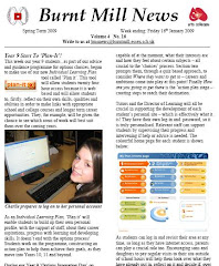
Thursday, 29 January 2009
Burnt Mill Magazine

When researching for an online magazine, I came across a issue that Burnt Mill do, although it is not student run, I found that it was still worth looking in to.
What strikes me straight away about this magazine is how the heading hits you straight away. It is neatly in line with the Burnt Mill badge to the left of it, and the arts colleges symbol to the right of it. This symmetrical look gives the magazine a formal look and feel to it almost immediately.
The first article is about the year 9 students beginning a programme for Burnt Mill's new individual learning plan. It is noticeable that if you look at the left hand side the beginning of the new sentences are completely in line, as well as the picture. This gives it a more formal look and shows that the magazine is neat and tidy. They have included two photographs on the first page, with a badge in the first article about plan it.
The second page is about the new plasma televisions that have been put up around the school. The next article on the page goes on about the current year 11 leaving, and how they have had their year photograph taken that will go up on the wall with the previous year 11's from years before them, and how the students can be seen looking at relatives in the photos from before.
The language used in this magazine is extremely formal, indicating that it is aimed towards the parents more so than the pupils. Although pupils are known for reading the magazine, it is informing the parents about what is happening around the school.
However, there is a section, with a question on Barack Obama, and after it says:
"This question carries a £20 gift prize of a Woolworths - sorry, I mean HMV voucher for the first correct answer out of the box at astudent services."
This makes the magazine a bit more informal by including a joke, and makes it seem a bit more relaxed.
Online school magazine - search one
I have been researching for the past hour for an online school magazine and am finding it a very hard task. It is easy to find details of one but to actually find an online one is hard. I have looked at local schools in my area, but fail to find a student run magazine.
I will continue my research and endeavour to find one.
It is extremely simple to find University magazines, but is a challenge to find school magazines.
I will continue my research and endeavour to find one.
It is extremely simple to find University magazines, but is a challenge to find school magazines.
Wednesday, 21 January 2009
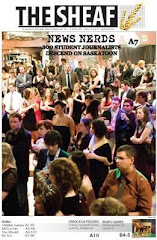
The Sheaf
In today's lesson, we carried out research on a newspaper for a university.
The Sheaf has been the University of Saskathewan student's newspaper since 1912 and has distinct features that I will use, that I didn't think of before.

It's distribution is weekly, however, I think weekly would be a bit too much for a magazine at school, therefore I am considering distributing my magazine fortnightly.
In this newspaper, it included campus chat, which was very entertaining, in mine it would have to be different, involving the students as it is a younger age.
An opinion poll was another idea I came up with whilst looking at this newspaper online.
Advice pages would be good for students in sixth form, helping people coping with stress and for people to write in, also letters to the editor would be good.
I also read that The Sheaf has a policy, which I would include in my magazine.
Today's lesson was extremely useful in learning about this newspaper, and although it is a newspaper it has helped me understand what students want, and what content would be good to include in my magazine.
Pleminary Task
On Monday's lesson, 19/01/09, we were set the Pleminary Task.
The task involves creating a front page and a contents page for a school magazine, which must include a medium shot of a student.
The magazine must also include a minimum of 4 images.
I will endeavour to keep my magazine simple, and set myself realistic tasks.
I have decided to use a blog as a way of recording my research.
I will start my research into real texts, considering audience awareness and I will plan carefully thinking in terms of stages and I will also ensure that I follow my deadlines.
It is extremely important that I set myself goals and stick to them.
For my research, and using my blog, I will answer the following questions:
1) In what ways does your product use, develop or challenge forms and conventions of real media products?
2) How effective is the combination of your product and evaluation texts?
3) What have you learned from your audience feedback?
4) How did you use media technologies in the construction, research planning and evaluation stages?
Subscribe to:
Comments (Atom)
